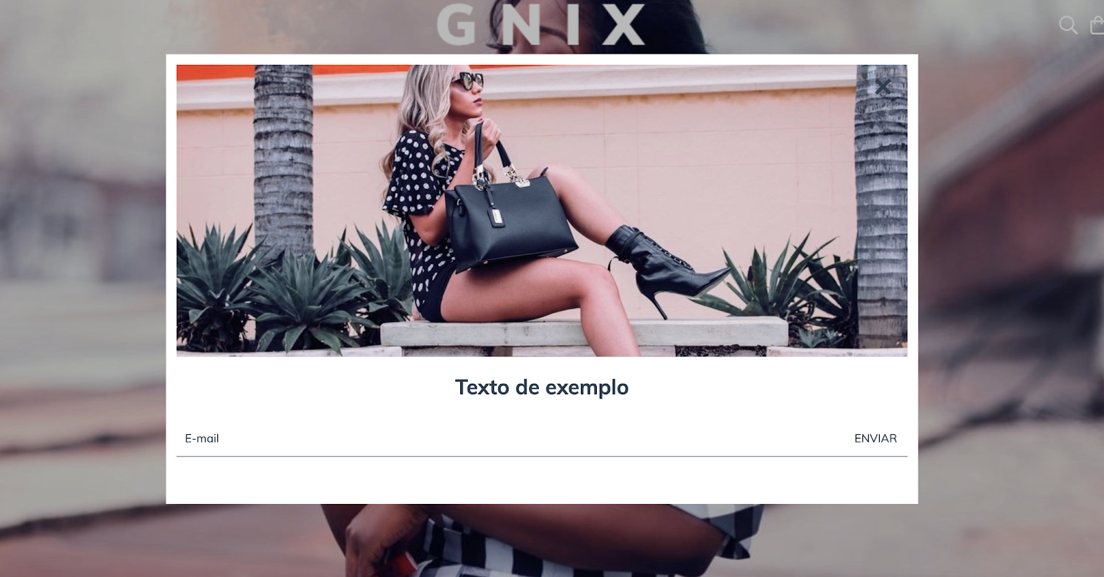
Neste tutorial vamos adicionar um popup que aparece na home page com a possibilidade de mostrar:
- Uma imagem
- Um texto
- Um link para a imagem e o texto
- O formulário de inscrição da newsletter
HTML
A primeira coisa que vamos fazer é criar a pasta home e os forms dentro da pasta snipplets.
1. Dentro da pasta home, adicionamos o snipplet home-popup.tpl com o seguinte código:
{% embed "snipplets/modal.tpl" with{modal_id: 'home-modal', modal_position: 'bottom', modal_transition: 'slide', modal_header: false, modal_footer: false, modal_width: 'centered', modal_class: 'centered-small', modal_close_class: 'invert mt-2 mr-3'  } %}

    {% block modal_body %}
        {% if "home_popup_image.jpg" | has_custom_image %}
            {% if settings.home_popup_url %}
            <a href="{{ settings.home_popup_url }}">
            {% endif %}
                <div class="lazyload fade-in modal-img-full img-responsive" data-bg='{{ "home_popup_image.jpg" | static_url | settings_image_url }}' style="background-image: url({{ 'home_popup_image.jpg' | static_url | settings_image_url('thumb') }});"></div>
            {% if settings.home_popup_url %}
            </a>
            {% endif %}
        {% endif %}

        {% if settings.home_popup_txt or settings.home_news_box %}
        <div class="align-items-center {% if not 'home_popup_image.jpg' | has_custom_image %}mt-3{% endif %}">
            {% if settings.home_popup_txt %}
                <div class="col-12">
                    {% if settings.home_popup_url %}
                    <a href="{{ settings.home_popup_url }}">
                    {% endif %}
                    <h3 class="text-center mt-3 {% if not settings.home_news_box %}mb-0{% endif %}">{{ settings.home_popup_txt }}</h3>
                    {% if settings.home_popup_url %}
                    </a>
                    {% endif %}
                </div>
            {% endif %}

            {% if settings.home_news_box %}
                <div class="col-12 newsletter">
                    <div id="news-popup-form-container">
                        <form id="news-popup-form" method="post" action="/winnie-pooh" class="js-news-form">
                            <div class="input-append">

                                {% embed "snipplets/forms/form-input.tpl" with{input_for: 'email', type_email: true, input_name: 'email', input_id: 'email', input_placeholder: 'Email' | translate, input_aria_label: 'Email' | translate } %}
                                {% endembed %}

                                <div class="winnie-pooh" style="display: none;">
                                    <label for="winnie-pooh-newsletter">{{ "No completar este campo" | translate }}</label>
                                    <input id="winnie-pooh-newsletter" type="text" name="winnie-pooh"/>
                                </div>
                                <input type="hidden" name="name" value="{{ "Sin nombre" | translate }}" />
                                <input type="hidden" name="message" value="{{ "Pedido de inscripción a newsletter" | translate }}" />
                                <input type="hidden" name="type" value="newsletter" />
                                <div class="js-news-spinner text-center" style="display: none;">
                                    {% include "snipplets/svg/sync-alt.tpl" with {svg_custom_class: "icon-inline svg-icon-text icon-spin icon-2x mb-3"} %}
                                </div>
                                <div style='display: none;' class="js-news-popup-success alert alert-success">{{ "¡Gracias por suscribirte! A partir de ahora vas a recibir nuestras novedades en tu email" | translate }}</div>
                                <div style='display: none;'class="js-news-popup-failed alert alert-danger">{{ "Necesitamos tu email para enviarte nuestras novedades." | translate }}</div>
                                <input type="submit" name="contact" class="btn newsletter-btn js-news-send" value='{{ "Enviar" | translate }}'>
                            </div>
                        </form>
                    </div>
                </div>
            {% endif %}
        </div>
        {% endif %}
    {% endblock %}
{% endembed %}
2. Na pasta de forms, adicionaremos o snipplet form-input.tpl que usaremos no campo de inscrição para a newsletter:
{# /*============================================================================
  #Form input
==============================================================================*/

#Properties

#Group
    //input_group_custom_class for custom CSS classes
#Label
    // input_label_id for ID
    // input_for for label for
    // input_label_custom_class for custom CSS classes
    // input_label_text for label text
#Prepend
    // input_prepend_content to add content before input
#Container (Only if has prepend or append)
    // form_control_container_custom_class for container custom class. E.g: col
#Input
    // Can be text_area or input
    // input_type to define type (text, tel, number or passowrd)
    // input_id for id
    // input_name for name
    // input_value for val
    // input_placeholder for placeholder
    // input_custom_class for custom CSS classes
    // input_rows for textarea rows
    // input_data_attr for data attributes
    // input_data_val for input_data_attr value
    // input_aria_label for aria-label attribute
#Append
    // input_append_content to add content after input
#Alerts
    // input_form_alert to insert alerts
#}

<div class="form-group {{ input_group_custom_class }}">
    {% if input_label_text %}
        <label {% if input_label_id %}id="{{ input_label_id }}"{% endif %} class="form-label {{ input_label_custom_class }}" {% if input_for %}for="{{ input_name }}"{% endif %}>{{ input_label_text }}</label>
    {% endif %}
    {% block input_prepend_content %}
    {% endblock input_prepend_content %}
    {% if input_append_content or input_prepend_content %}
    <div class="form-control-container {{ form_control_container_custom_class }}">
    {% endif %}
    {% if text_area %}
        <textarea
            {% if input_id %}id="{{ input_id }}"{% endif %}
            class="form-control form-control-area {{ input_custom_class }} {% if input_append_content %}form-control-inline{% endif %}"
            autocorrect="off"
            autocapitalize="off"
            {% if input_name %}name="{{ input_name }}"{% endif %}
            {% if input_value %}value="{{ input_value }}"{% endif %}
            {% if input_rows %}rows="{{ input_rows }}"{% endif %}
            {% if input_placeholder %}placeholder="{{ input_placeholder }}"{% endif %}
            {% if input_data_attr %}data-{{ input_data_attr }}="{{ input_data_val }}"{% endif %}></textarea>
    {% else %}
        <input
            type="{% if type_text %}text{% elseif type_number %}number{% elseif type_tel %}tel{% elseif type_password %}password{% elseif type_hidden %}hidden{% endif %}"
            {% if input_id %}id="{{ input_id }}"{% endif %}
            class="form-control {{ input_custom_class }} {% if input_append_content %}form-control-inline{% endif %}"
            autocorrect="off"
            autocapitalize="off"
            {% if type_password %}autocomplete="off"{% endif %}
            {% if input_name %}name="{{ input_name }}"{% endif %}
            {% if input_value %}value="{{ input_value }}"{% endif %}
            {% if input_min %}min="{{ input_min }}"{% endif %}
            {% if input_placeholder %}placeholder="{{ input_placeholder }}"{% endif %}
            {% if input_data_attr %}data-{{ input_data_attr }}="{{ input_data_val }}"{% endif %}
            {% if input_aria_label %}aria-label="{{ input_aria_label }}"{% endif %}/>
    {% endif %}
    {% if input_append_content or input_prepend_content %}
    </div>
    {% endif %}
    {% block input_append_content %}
    {% endblock input_append_content %}
    {% if input_help %}
    <div class="mt-4 text-center">
        <a href="{{ input_help_link }}" class="btn-link {{ input_link_class }}">{% block input_help_text %}{% endblock input_help_text %}</a>
    </div>
    {% endif %}
    {% block input_form_alert %}
    {% endblock input_form_alert %}
</div>
3. Agora precisamos criar o snipplet para o componente modal ou pop-up dentro da pasta snipplets. Este tpl é chamado modal.tpl e o código é:
{# /*============================================================================
  #Modal
==============================================================================*/

#Properties
    // ID
    // Position - Top, Right, Bottom, Left
    // Transition - Slide and Fade
    // Width - Full and Box
    // modal_form_action - For modals that has a form

#Head
    // Block - modal_head
#Body
    // Block - modal_body
#Footer
    // Block - modal_footer

#}

{% set modal_overlay = modal_overlay | default(true) %}


<div id="{{ modal_id }}" class="js-modal modal modal-{{ modal_class }} modal-{{modal_position}} transition-{{modal_transition}} modal-{{modal_width}} transition-soft" style="display: none;">
    {% if modal_form_action %}
    <form action="{{ modal_form_action }}" method="post" class="{{ modal_form_class }}">
    {% endif %}
    {% if modal_header %}
        <div class="js-modal-close modal-header">
            <span class="modal-close {{ modal_close_class }}">
                {% include "snipplets/svg/times.tpl" with {svg_custom_class: "icon-inline svg-icon-text"} %}
            </span>
            {% block modal_head %}{% endblock %}
        </div>
    {% else %}
        <span class="js-modal-close modal-close no-header {{ modal_close_class }}">
            {% include "snipplets/svg/times.tpl" with {svg_custom_class: "icon-inline icon-2x svg-icon-text"} %}
        </span>
    {% endif %}
    <div class="modal-body">
        {% block modal_body %}{% endblock %}
    </div>
    {% if modal_footer %}
        <div class="modal-footer d-md-block">
            {% block modal_foot %}{% endblock %}
        </div>
    {% endif %}
    {% if modal_form_action %}
    </form>
    {% endif %}
</div>
4. Neste temos que chamar o snipplet do pop-up de notícias no template templates/home.tpl para exibi-lo na página inicial.
{% if settings.home_promotional_popup %}
    {% include 'snipplets/home/home-popup.tpl' %}
{% endif %}
5. Por último, para a parte do HTML, precisamos adicionar uma pasta SVG dentro da pasta snipplets, onde adicionamos os snipplets para os ícones usados. Neste caso, eles são os seguintes:
times.tpl
<svg class="{{ svg_custom_class }}" xmlns="http://www.w3.org/2000/svg" viewBox="0 0 320 512"><path d="M207.6 256l107.72-107.72c6.23-6.23 6.23-16.34 0-22.58l-25.03-25.03c-6.23-6.23-16.34-6.23-22.58 0L160 208.4 52.28 100.68c-6.23-6.23-16.34-6.23-22.58 0L4.68 125.7c-6.23 6.23-6.23 16.34 0 22.58L112.4 256 4.68 363.72c-6.23 6.23-6.23 16.34 0 22.58l25.03 25.03c6.23 6.23 16.34 6.23 22.58 0L160 303.6l107.72 107.72c6.23 6.23 16.34 6.23 22.58 0l25.03-25.03c6.23-6.23 6.23-16.34 0-22.58L207.6 256z"/></svg>sync-alt.tpl
<svg class="{{ svg_custom_class }}" xmlns="http://www.w3.org/2000/svg" viewBox="0 0 512 512"><path d="M483.515 28.485L431.35 80.65C386.475 35.767 324.485 8 256 8 123.228 8 14.824 112.338 8.31 243.493 7.971 250.311 13.475 256 20.301 256h28.045c6.353 0 11.613-4.952 11.973-11.294C66.161 141.649 151.453 60 256 60c54.163 0 103.157 21.923 138.614 57.386l-54.128 54.129c-7.56 7.56-2.206 20.485 8.485 20.485H492c6.627 0 12-5.373 12-12V36.971c0-10.691-12.926-16.045-20.485-8.486zM491.699 256h-28.045c-6.353 0-11.613 4.952-11.973 11.294C445.839 370.351 360.547 452 256 452c-54.163 0-103.157-21.923-138.614-57.386l54.128-54.129c7.56-7.56 2.206-20.485-8.485-20.485H20c-6.627 0-12 5.373-12 12v143.029c0 10.691 12.926 16.045 20.485 8.485L80.65 431.35C125.525 476.233 187.516 504 256 504c132.773 0 241.176-104.338 247.69-235.493.339-6.818-5.165-12.507-11.991-12.507z"/></svg>CSS
Requisito:
Ter adicionado helper classes em seu layout. Você pode seguir este pequeno tutorial para fazer isso (é só copiar e colar algumas classes, não leva mais que 1 minuto).
1. Adicionamos o seguinte SASS de cores em style-colors.scss.tpl (ou na stylesheet do seu layout que possui as cores e fontes da loja). Lembre-se de que as variáveis de cores e fontes podem variar em relação ao seu layout:
@mixin prefix($property, $value, $prefixes: ()) {
  @each $prefix in $prefixes {
      #{'-' + $prefix + '-' + $property}: $value;
  }
    #{$property}: $value;
}

/* // Modals */

.modal{
  color: $main-foreground;
  background-color:$main-background;
}

{# /* // Buttons */ #}

.btn{
  text-decoration: none;
  text-align: center;
  border: 0;
  cursor: pointer;
  -webkit-appearance: none;
  -moz-appearance: none;
  appearance: none;
  text-transform: uppercase;
  background: none;
  @include prefix(transition, all 0.4s ease, webkit ms moz o);
  &:hover,
  &:focus{
    outline: 0;
    opacity: 0.8;
  }
  &[disabled],
  &[disabled]:hover{
    opacity: 0.5;
    cursor: not-allowed;
    outline: 0;
  }
  &-default{
    padding: 10px 15px;
    background-color: rgba($main-foreground, .2);
    color: $main-foreground;
    fill: $main-foreground;
    font-weight: bold;
  }
  &-primary{
    padding: 15px;
    background-color: $primary-color;
    color: $main-background;
    fill: $main-background;
    letter-spacing: 4px;
    &:hover{
      color: $main-background;
      fill: $main-background;
    }
  }
  &-secondary{
    padding: 10px 15px;
    background-color: $main-background;
    color: $main-foreground;
    fill: $main-foreground;
    border: 1px solid $main-foreground;
  }
  &-block{
    float: left;
    width: 100%;
  }
  &-small{
    display: inline-block;
    padding: 10px;
    font-size: 10px;
    letter-spacing: 2px;
  }
}

/* // Links */


.btn-link{
  color: $primary-color;
  fill: $primary-color;
  text-transform: uppercase;
  border-bottom: 1px solid;
  font-weight: bold;
  cursor: pointer;
  &:hover,
  &:focus{
    color: rgba($primary-color, .5);
    fill: rgba($primary-color, .5);
  }
}

{# /* // Forms */ #}

input,
textarea {
  font-family: $body-font;
}

.form-control {
  display: block;
  padding: 10px 8px;
  width: 100%;
  border: 0;
  border-bottom: 1px solid rgba($main-foreground, .5);
  -webkit-appearance: none;
  -moz-appearance: none;
  appearance: none;
  color: $main-foreground;
  background-color: $main-background;
  &:focus{
    outline: 0;
  }
  &-inline{
    display: inline;
  }
}

.form-control::-webkit-input-placeholder {
  color: $main-foreground;
}
.form-control:-moz-placeholder {
  color: $main-foreground;
}
.form-control::-moz-placeholder {
  color: $main-foreground;
}
.form-control:-ms-input-placeholder {
  color: $main-foreground;
}

{# /* // Newsletter */ #}

.newsletter-btn {
  color: $main-foreground;
}
2. Adicione os estilos no arquivo static/style-critical.tpl
Se em seu layout você usar um stylesheet para o CSS crítico, precisaremos do seguinte código dentro dele, do contrário, você pode unificar o CSS dos passos 2 e 3 em um único arquivo.
{# /* // Forms */ #}

.form-group {
  position: relative;
  width: 100%;
}
.form-group .form-select-icon{
  position: absolute;
  bottom: 12px;
  right: 0;
  pointer-events: none;
}
.form-row {
  width: auto;
  display: -webkit-box;
  display: -ms-flexbox;
  display: flex;
  -ms-flex-wrap: wrap;
  flex-wrap: wrap;
  margin-right: -5px;
  margin-left: -5px;
  clear: both;
}

.form-row > .col,
.form-row > [class*=col-]{
  padding-right: 5px;
  padding-left: 5px;
}

.form-label {
  display: block;
  font-size: 10px;
  text-transform: uppercase;
}
3. Adicione os estilos no arquivo static/style-async.tpl
Se em seu layout você usar um stylesheet CSS assíncrono, precisaremos do seguinte código dentro dela, do contrário, você pode unificar o CSS dos passos 2 e 3 em um único arquivo.
{# /* // Modals */ #}

.modal {
  position: fixed;
  top: 0;
  display: block;
  width: 80%;
  height: 100%;
  padding: 10px;
  -webkit-overflow-scrolling: touch;
  overflow-y: auto;
  transition: all .2s cubic-bezier(.16,.68,.43,.99);
  z-index: 20000;
  &-img-full{
    max-width: 100%;
    max-height: 190px;
 }
 &-header{
    width: calc(100% + 20px);
    margin: -10px -15px 10px -10px;
    padding: 10px 15px;
    font-size: 20px;
  }
  &-footer{
    padding: 10px;
    clear: both;
  }
  &-full {
    width: 100%;
  }
  &-docked-sm{
    width: 100%;
  }
  &-docked-small{
    width: 80%;
  }
  &-top{
    top: -100%;
    left: 0;
  }
  &-bottom{
    top: 100%;
    left: 0;
  }
  &-left{
    left: -100%;
  }
  &-right{
    right: -100%;
  }
  &-centered{
    height: 100%;
    width: 100%;
    &-small{
      height: auto;
      width: 90%;
      max-height: 80%;
      left: 5%;
      margin: 50% auto 50% auto;
    }
  }
  &-top.modal-show,
  &-bottom.modal-show {
    top: 0;
  }
  &-left.modal-show {
    left: 0;
  }
  &-right.modal-show {
    right: 0;
  }
  &-close {
    display: inline-block;
    padding: 1px 5px 5px 0;
    margin-right: 5px;
    vertical-align: middle;
    cursor: pointer;
    &.no-header{
      position: absolute;
      right: 5px;
    }
  }
  .tab-group{
    margin:  0 -10px 20px -10px;
  }
}

.modal-overlay{
  position: fixed;
  top: 0;
  left: 0;
  width: 100%;
  height: 100%;
  background: #00000047;
  z-index: 10000;
}

{# /* // Forms */ #}

.form-group{
  margin-bottom: 20px;
  .form-label{
    float: left;
    width: 100%;
    margin-bottom: 10px;
  }
  .alert{
    margin: 10px 0 0 0;
  }
}

{# /* // Newsletter */ #}

.newsletter {
  form {
    position: relative;
    .newsletter-btn {
      position: absolute;
      top: 0;
      right: 0px;
      padding: 10px;
    }
  }
}

{# /* // Min width 768px */ #}

@media (min-width: 768px) {

  {# /* //// Components */ #}

  {# /* Modals */ #}

  .modal{
    &-centered{
      height: 80%;
      width: 80%;
      left: 10%;
      margin: 5% auto;
      &-small{
        height: auto;
        width: 50%;
        max-height: 80%;
        left: 25%;
        margin: 5% auto 10% auto;
      }
    }
    &-docked-sm{
      width: 500px;
    }
    &-docked-small{
      width: 350px;
    }
  }
}
JS
⚠️ A partir do dia 30 de janeiro de 2023, a biblioteca jQuery será removida do código de nossas lojas, portanto, a função "$" não poderá ser utilizada.
1. JavaScript precisam ser adicionados no arquivo store.js.tpl (ou onde você tem suas funções JS). O código que precisamos é o seguinte:
{#/*============================================================================
      #Modals
    ==============================================================================*/ #}

 {# Full screen mobile modals back events #}

if (window.innerWidth < 768) {

    {# Clean url hash function #}

    cleanURLHash = function(){
        const uri = window.location.toString();
        const clean_uri = uri.substring(0, uri.indexOf("#"));
        window.history.replaceState({}, document.title, clean_uri);
    };

    {# Go back 1 step on browser history #}

    goBackBrowser = function(){
        cleanURLHash();
        history.back();
    };

    {# Clean url hash on page load: All modals should be closed on load #}

    if(window.location.href.indexOf("modal-fullscreen") > -1) {
        cleanURLHash();
    }

    {# Open full screen modal and url hash #}

    jQueryNuvem(document).on("click", ".js-fullscreen-modal-open", function(e) {
        e.preventDefault();
        var modal_url_hash = jQueryNuvem(this).data("modalUrl");
        window.location.hash = modal_url_hash;
    });

    {# Close full screen modal: Remove url hash #}

    jQueryNuvem(document).on("click", ".js-fullscreen-modal-close", function(e) {
        e.preventDefault();
        goBackBrowser();
    });

    {# Hide panels or modals on browser backbutton #}

    window.onhashchange = function() {
        if(window.location.href.indexOf("modal-fullscreen") <= -1) {

            {# Close opened modal #}

            if(jQueryNuvem(".js-fullscreen-modal").hasClass("modal-show")){

                {# Remove body lock only if a single modal is visible on screen #}

                if(jQueryNuvem(".js-modal.modal-show").length == 1){
                    jQueryNuvem("body").removeClass("overflow-none");
                }

                var $opened_modal = jQueryNuvem(".js-fullscreen-modal.modal-show");
                var $opened_modal_overlay = $opened_modal.prev();

                $opened_modal.removeClass("modal-show");
                setTimeout(() => $opened_modal.hide(), 500);
                $opened_modal_overlay.fadeOut(500);
            }
        }
    }
}

jQueryNuvem(document).on("click", ".js-modal-open", function(e) {
    e.preventDefault();
    var modal_id = jQueryNuvem(this).data('toggle');
    var $overlay_id = jQueryNuvem('.js-modal-overlay[data-modal-id="' + modal_id + '"]');
    if (jQueryNuvem(modal_id).hasClass("modal-show")) {
        let modal = jQueryNuvem(modal_id).removeClass("modal-show");
        setTimeout(() => modal.hide(), 500);
    } else {

        {# Lock body scroll if there is no modal visible on screen #}

        if(!jQueryNuvem(".js-modal.modal-show").length){
            jQueryNuvem("body").addClass("overflow-none");
        }
        $overlay_id.fadeIn(400);
        jQueryNuvem(modal_id).detach().appendTo("body");
        $overlay_id.detach().insertBefore(modal_id);
        jQueryNuvem(modal_id).show().addClass("modal-show");
    }
});

jQueryNuvem(document).on("click", ".js-modal-close", function(e) {
    e.preventDefault();
    {# Remove body lock only if a single modal is visible on screen #}

    if(jQueryNuvem(".js-modal.modal-show").length == 1){
        jQueryNuvem("body").removeClass("overflow-none");
    }
    var $modal = jQueryNuvem(this).closest(".js-modal");
    var modal_id = $modal.attr('id');
    var $overlay_id = jQueryNuvem('.js-modal-overlay[data-modal-id="#' + modal_id + '"]');
    $modal.removeClass("modal-show");
    setTimeout(() => $modal.hide(), 500);
    $overlay_id.fadeOut(500);

    {# Close full screen modal: Remove url hash #}

    if ((window.innerWidth < 768) && (jQueryNuvem(this).hasClass(".js-fullscreen-modal-close"))) {
        goBackBrowser();
    }
});

jQueryNuvem(document).on("click", ".js-modal-overlay", function(e) {
    e.preventDefault();
    {# Remove body lock only if a single modal is visible on screen #}

    if(jQueryNuvem(".js-modal.modal-show").length == 1){
        jQueryNuvem("body").removeClass("overflow-none");
    }
    var modal_id = jQueryNuvem(this).data('modalId');
    let modal = jQueryNuvem(modal_id).removeClass("modal-show");
    setTimeout(() => modal.hide(), 500);
    jQueryNuvem(this).fadeOut(500);

    if (jQueryNuvem(this).hasClass("js-fullscreen-overlay") && (window.innerWidth < 768)) {
        cleanURLHash();
    }
});

{% if template == 'home' and settings.home_promotional_popup %}

    {# /* // Home popup and newsletter popup */ #}

    jQueryNuvem('#news-popup-form').on("submit", function () {
        jQueryNuvem(".js-news-spinner").show();
        jQueryNuvem(".js-news-send, .js-news-popup-submit").hide();
        jQueryNuvem(".js-news-popup-submit").prop("disabled", true);
    });


    LS.newsletter('#news-popup-form-container', '#home-modal', '{{ store.contact_url | escape('js') }}', function (response) {
        jQueryNuvem(".js-news-spinner").hide();
        jQueryNuvem(".js-news-send, .js-news-popup-submit").show();
        var selector_to_use = response.success ? '.js-news-popup-success' : '.js-news-popup-failed';
        let newPopupAlert = jQueryNuvem(this).find(selector_to_use).fadeIn(100);
        setTimeout(() => newPopupAlert.fadeOut(500), 4000);
        if (jQueryNuvem(".js-news-popup-success").css("display") == "block") {
            setTimeout(function () {
                jQueryNuvem('[data-modal-id="#home-modal"]').fadeOut(500);
                let homeModal = jQueryNuvem("#home-modal").removeClass("modal-show");
                setTimeout(() => homeModal.hide(), 500);
            }, 2500);
        }
        jQueryNuvem(".js-news-popup-submit").prop("disabled", false);
    });

    var callback_show = function(){
        jQueryNuvem('.js-modal-overlay[data-modal-id="#home-modal"]').fadeIn(500);
        jQueryNuvem("#home-modal").detach().appendTo("body").show().addClass("modal-show");
    }
    var callback_hide = function(){
        jQueryNuvem('.js-modal-overlay[data-modal-id="#home-modal"]').fadeOut(500);
        let homeModal = jQueryNuvem("#home-modal").removeClass("modal-show");
        setTimeout(() => homeModal.hide(), 500);
    }
    LS.homePopup({
        selector: "#home-modal",
        timeout: 10000,
        mobile_max_pixels: 0,
    }, callback_hide, callback_show);
{% endif %}
Dentro deste código, encontramos JS gerais para o componente “modal” e também nossas próprias funções para validar e enviar a newsletter que está dentro do popup.
2. Então nós temos que adicionar o plugin Jquery Cookie no arquivo static/js/external.js.tpl ou onde você tem os plugins em seu design.
{# /*! jquery.cookie v1.4.1 | MIT */ #}
!function(a){"function"==typeof define&&define.amd?define(["jquery"],a):"object"==typeof exports?a(require("jquery")):a(jQuery)}(function(a){function b(a){return h.raw?a:encodeURIComponent(a)}function c(a){return h.raw?a:decodeURIComponent(a)}function d(a){return b(h.json?JSON.stringify(a):String(a))}function e(a){0===a.indexOf('"')&&(a=a.slice(1,-1).replace(/\\"/g,'"').replace(/\\\\/g,"\\"));try{return a=decodeURIComponent(a.replace(g," ")),h.json?JSON.parse(a):a}catch(b){}}function f(b,c){var d=h.raw?b:e(b);return a.isFunction(c)?c(d):d}var g=/\+/g,h=a.cookie=function(e,g,i){if(void 0!==g&&!a.isFunction(g)){if(i=a.extend({},h.defaults,i),"number"==typeof i.expires){var j=i.expires,k=i.expires=new Date;k.setTime(+k+864e5*j)}return document.cookie=[b(e),"=",d(g),i.expires?"; expires="+i.expires.toUTCString():"",i.path?"; path="+i.path:"",i.domain?"; domain="+i.domain:"",i.secure?"; secure":""].join("")}for(var l=e?void 0:{},m=document.cookie?document.cookie.split("; "):[],n=0,o=m.length;o>n;n++){var p=m[n].split("="),q=c(p.shift()),r=p.join("=");if(e&&e===q){l=f(r,g);break}e||void 0===(r=f(r))||(l[q]=r)}return l};h.defaults={},a.removeCookie=function(b,c){return void 0===a.cookie(b)?!1:(a.cookie(b,"",a.extend({},c,{expires:-1})),!a.cookie(b))}});
3. Como neste tutorial usamos a técnica de lazy load com o plugin Lazysizes, precisamos adicioná-lo. Para ver como fazer isso, você pode ler este pequeno artigo e continuar com este tutorial.
Configurações
No arquivo config/settings.txt, adicionaremos a caixa de seleção para ativar ou desativar o vídeo, bem como o campo para o link do YouTube ou do Vimeo.
collapse
        title = Pop-up promocional
    checkbox
        name = home_promotional_popup
        description = Mostrar pop-up
    subtitle
        subtitle = Imagen para el pop-up
    image
        original = home_popup_image.jpg
        title = Cargar imagen (JPG, GIF, PNG)
    subtitle
        subtitle = Frase motivadora para el pop-up
    i18n_input
        name = home_popup_txt
    i18n_input
        name = home_popup_url
        description = Link (Opcional)
    subtitle
        subtitle = Newsletter
    checkbox
        name = home_news_box
        description = Permitir que tus clientes se registren para recibir novedades desde el pop-up (Opcional)
Traduções
Nesta etapa, adicionamos os textos para as traduções no arquivo config/translations.txt
--- --- Home Popup

es "Pop-up promocional"
pt "Popup promocional"
es_mx "Pop-up promocional"

es "Mostrar Pop-up"
pt "Mostrar popup"
es_mx "Mostrar Pop-up"

es "Permitir que tus clientes se registren para recibir novedades desde el pop-up (Opcional)"
pt "Permitir que seus clientes se inscrevam na newsletter (Opcional)"
es_mx "Permitir que tus clientes se registren para recibir novedades desde el pop-up (Opcional)"

es "Imagen para el pop-up"
pt "Imagem para popup"
es_mx "Imagen para el pop-up"

es "Frase motivadora para el pop-up"
pt "Frase motivadora para o pop-up"
es_mx "Frase motivadora del pop-up"
Ativação
Por fim, você pode ativar o pop-up no Administrador Nuvem, na seção “Personalizar seu layout atual” dentro de “Página inicial”:
Observações
Uma vez que pop-up for exibido, ele não será mais exibido novamente até que 15 dias se passem. Para vê-lo, você sempre pode entrar com o navegador em uma janela no modo de navegação anônima.